library(pliman)
h <- image_import("imgs/sbr_h.png")
s <- image_import("imgs/sbr_s.png")
b <- image_import("imgs/sbr_b.png")

sbr <- measure_disease(
  pattern = "img",
  dir_original = "imgs/originals" ,
  dir_processed = "imgs/processed",
  save_image = TRUE,
  img_healthy = h,
  img_symptoms = s,
  img_background = b,
  show_original = FALSE, # set to TRUE for showing the original.
  col_background = "white",
  verbose = FALSE,
  plot = FALSE
)6 Standard area diagrams
6.1 Definitions
According to a glossary on phytopathometry (Bock et al. 2021), standard area diagram (SAD) can be defined as “a generic term for a pictorial or graphic representation (drawing or true-color photo) of selected disease severities on plants or plant parts (leaves, fruit, flowers, etc.) generally used as an aid for more accurate visual estimation (on the percentage scale) or classification (using an ordinal scale) of severity on a specimen”.
The Standard Area Diagrams (SADs), also known as diagrammatic scales, have a long history of use in plant pathology. The concept dates back to the late 1800s when the Cobb scale was developed, featuring five diagrams depicting a range of severity levels of rust pustules on wheat leaves.
In the past 20 years, plant pathologists have leveraged advancements in image processing and analysis tools, along with insights from psychophysical and measurement sciences, to develop SADs that are realistic (e.g., true-color photographs), validated, and depict severities that maximize estimation accuracy. SADs have been created in various color formats (black or white, two-color, or true-color) and with varying incremental scales (approximated linear or logarithmic) (Del Ponte et al. 2017).
SADs have proven beneficial in increasing the accuracy of visual estimates, as estimating percentage areas is generally more challenging than classifying severity into ordinal classes - there are numerous possibilities on the percentage scale, compared to the finite and small number of classes in ordinal scales. A recent quantitative review confirmed that using SADs often results in improved accuracy and precision of visual estimates. However, it also identified factors related to SAD design and structure, disease symptoms, and actual severity that affected the outcomes. In particular, SADs have shown greater utility for raters who are inherently less accurate and for diseases characterized by small and numerous lesions (Del Ponte et al. 2022). Here are examples of SADs in black and white, two-color, and true-color formats:
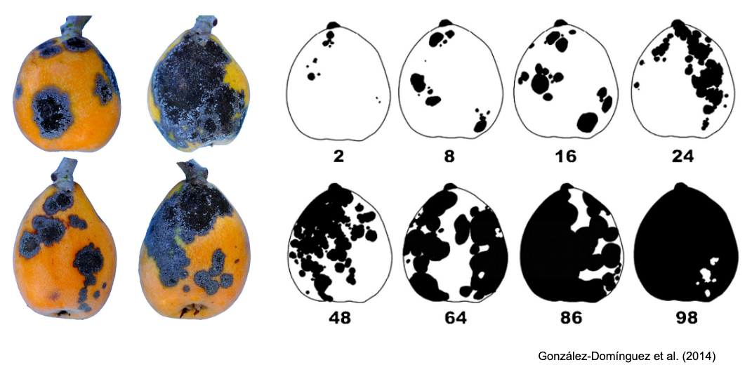
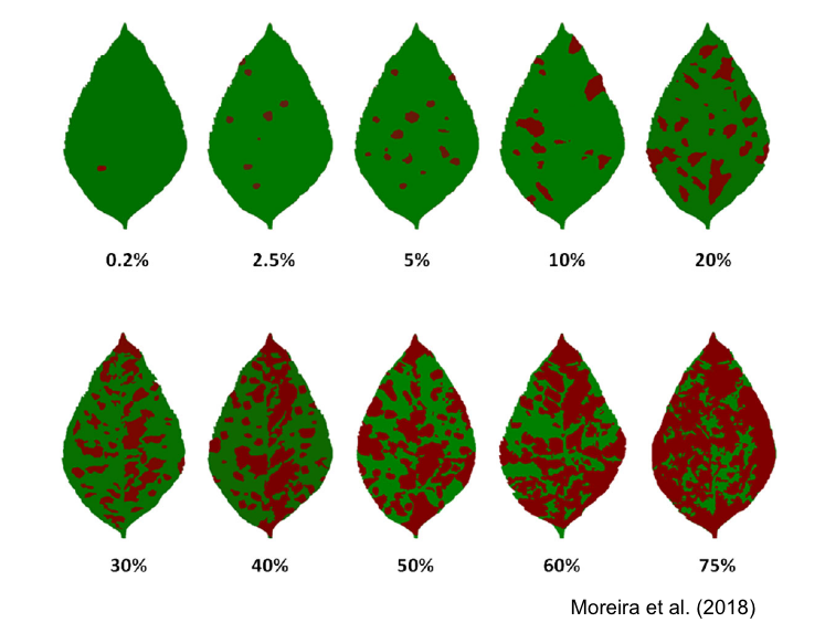
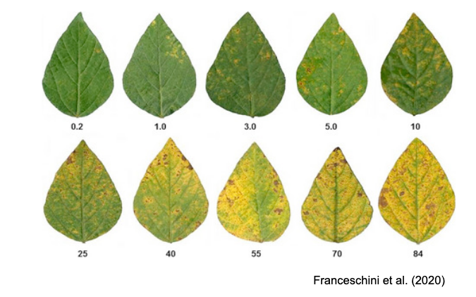
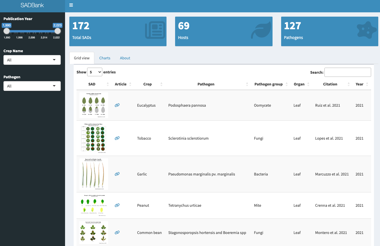
More SADs can be found in the SADBank, a curated collection of articles on SAD development and validation. Click on the image below to get access to the database.
6.2 SAD development and validation
A systematic review of the literature on SADs highlighted the most important aspects related to the development and validation of the tool (Del Ponte et al. 2017). A list of best practices was proposed in the review to guide future research in the area. The most important aspects to note are:
TipBest practices for SAD development
Sample a minimum number (e.g., n = 100) of specimens from natural epidemics representing the range of disease severity and typical symptoms observed.
Use reliable image analysis software to discriminate disease symptoms from healthy areas to calculate percent area affected.
When designing the illustrations for the SAD set, ensure that the individual diagrams are prepared realistically, whether line drawn, actual photos, or computer generated.
The number of diagrams should be no less than 6 and no more than 10, distributed approximately linearly, and spaced no more than 15% apart. Additional diagrams (±2) should be included between 0 and 10% severity.
For the validation trial, select at least 50 specimens representing the full range of actual severity and symptom patterns.
When selecting raters (a minimum of 15) for validation, make sure they do not have previous experience in using the SAD under evaluation.
Provide standard instructions on how to recognize the symptoms of the disease and how to assess severity, first without and then with the SAD.
Ideally repeat the assessment in time, with a 1- or 2-week interval, both without and with the aid, using the same set of raters in order to evaluate the effect of training and experience on gains in accuracy.
Both pre- and post-test experiment conditions should be the same to avoid any impact of distraction on accuracy of estimates during the tests.
6.3 Designing SADs in R
The diagrams used in a set have been developed using various methods and technologies, ranging from hand-drawn diagrams to actual photographs (Del Ponte et al. 2017). There is an increasing trend towards using actual photos that are digitally analyzed using standard image analysis software to determine the percent area affected. With this approach, a large set of images is analyzed, and some images are chosen to represent the severities in the SAD according to the scale structure.
In R, the pliman package has a function called sad() which allows the automatic generation of a SAD with a pre-defined number of diagrams. Firstly, as shown in the chapter on measuring foliar severity, the set of images to be selected needs to be analyzed using the measure_disease() function. Then, a SAD is automatically generated. In the function, the specimens with the smallest and highest severity will be selected for the SAD. The intermediate diagrams are sampled sequentially to achieve the pre-defined number of images after the severity has been ordered from low to high. More details of the function here.
Let’s use the same set of 10 soybean leaves, as seen in that chapter, depicting the rust symptoms and create the sbr object.
We are ready to run the sad() function to create a SAD with five diagrams side by side. The resulting SAD is in two colors by default. Set the argument show_original to TRUE for showing the original image in the SAD.
sad(sbr, 5, ncol = 5)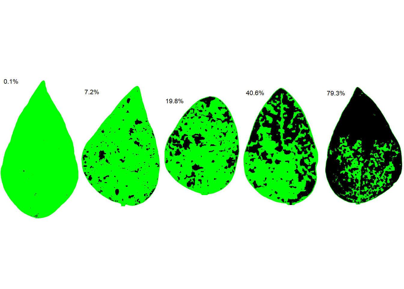
6.4 Analysis of SADs validation data
To evaluate the effect of SAD on accuracy components, analyze the data, preferably using concordance analysis methods (see chapter), to fully explore which component is affected and to gain insight into the ramification of errors. Linear regression should not be used as the sole method but it could be complementary for comparison with previous literature.
Inferential methods should be used for testing hypotheses related to gain in accuracy. If parametric tests are used (paired t-test for example), make sure to check that the assumptions are not violated. Alternatively, nonparametric tests (Wilcoxon signed rank) or nonparametric bootstrapping should be used when the conditions for parametric tests are not met. More recently, a (parametric) mixed modelling framework has been used to analyze SADs validation data where raters are taken as a random effect in the model (González-Domínguez et al. 2014; Franceschi et al. 2020; Pereira et al. 2020).
6.4.1 Nonparametric bootstrapping of differences
Bootstrap is a resampling method where large numbers of samples of the same size are repeatedly drawn, with replacement, from a single original sample. It is commonly used when the distribution of a statistic is unknown or complicated and the sample size is too small to draw a valid inference.
A bootstrap-based equivalence test procedure was first proposed as complementary to parametric (paired t-test) or non-parametric (Wilcoxon) to analyze severity estimation data in a study on the development and validation of a SADs for pecan scab (Yadav et al. 2012). The equivalence test was used to calculate 95% confidence intervals for each statistic by bootstrapping using the percentile method (with an equivalence test, the null hypothesis is the converse of H0, i.e. the null hypothesis is non-equivalence). In that study, the test was used to compare means of the CCC statistics across raters under two conditions: 1) without versus with the SAD; and 2) experienced versus inexperienced raters.
To apply the bootstrap-based equivalence test, let’s work with the CCC data for a sample of 20 raters who estimated severity of soybean rust SAD first without and then with the aid. The CCC was calculated as shown here.
library(tidyverse)
library(r4pde)

sbr <- tibble::tribble(
  ~rater, ~aided, ~unaided,
      1,   0.97,     0.85,
      2,   0.97,     0.85,
      3,   0.95,     0.82,
      4,   0.93,     0.69,
      5,   0.97,     0.84,
      6,   0.96,     0.86,
      7,   0.98,     0.78,
      8,   0.93,     0.72,
      9,   0.94,     0.67,
     10,   0.95,     0.53,
     11,   0.94,     0.78,
     12,   0.98,     0.89,
     13,   0.96,      0.8,
     14,   0.98,     0.87,
     15,   0.98,      0.9,
     16,   0.98,     0.87,
     17,   0.98,     0.84,
     18,   0.97,     0.86,
     19,   0.98,     0.89,
     20,   0.98,     0.78
  )
Let’s visualize the data using boxplots. Each point in the plot represents a rater.
theme_set(theme_r4pde())
sbr |>
  pivot_longer(2:3, names_to = "condition", values_to ="estimate") |>
  ggplot(aes(condition, estimate))+
  geom_boxplot(outlier.colour = NA)+
  geom_jitter(width = 0.05, size = 2, alpha = 0.5)+
  theme_r4pde()+
  ylim(0.4,1)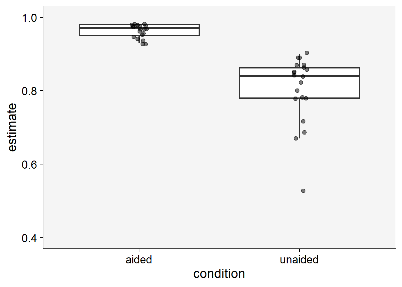
To proceed with bootstrapping, we first create a new variable to hold the differences between the means of the estimates (aided minus unaided). If the 95% CI does not include zero, this means that there was a significant improvement in the statistics.
# diff of means
sbr$diff <- sbr$aided - sbr$unaided

sbr |>
  ggplot(aes(x= diff))+
  theme_r4pde()+
  geom_histogram(bins = 10, color = "white")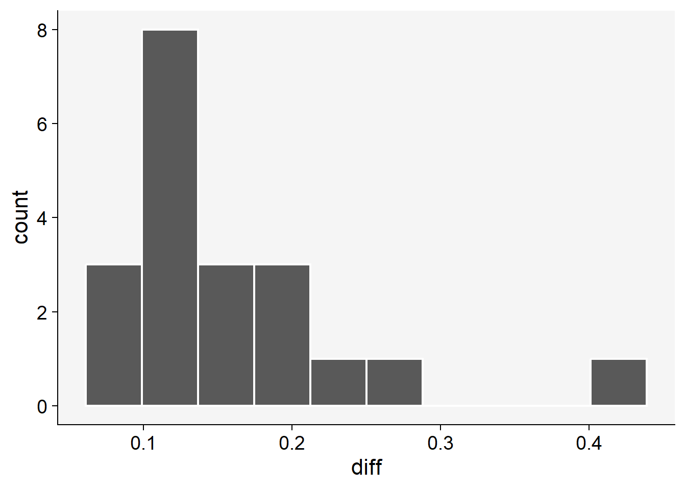
Using the simpleboot and boot packages of R:
library(simpleboot)
b.mean <- one.boot(sbr$diff, mean, 999)
boot::boot.ci(b.mean)
Warning in boot::boot.ci(b.mean): bootstrap variances needed for studentized
intervalsBOOTSTRAP CONFIDENCE INTERVAL CALCULATIONS
Based on 999 bootstrap replicates
CALL :
boot::boot.ci(boot.out = b.mean)
Intervals :
Level Normal Basic
95% ( 0.1226, 0.1950 ) ( 0.1195, 0.1915 )
Level Percentile BCa
95% ( 0.1275, 0.1995 ) ( 0.1285, 0.2020 )
Calculations and Intervals on Original Scalemean(b.mean$data)[1] 0.1595hist(b.mean)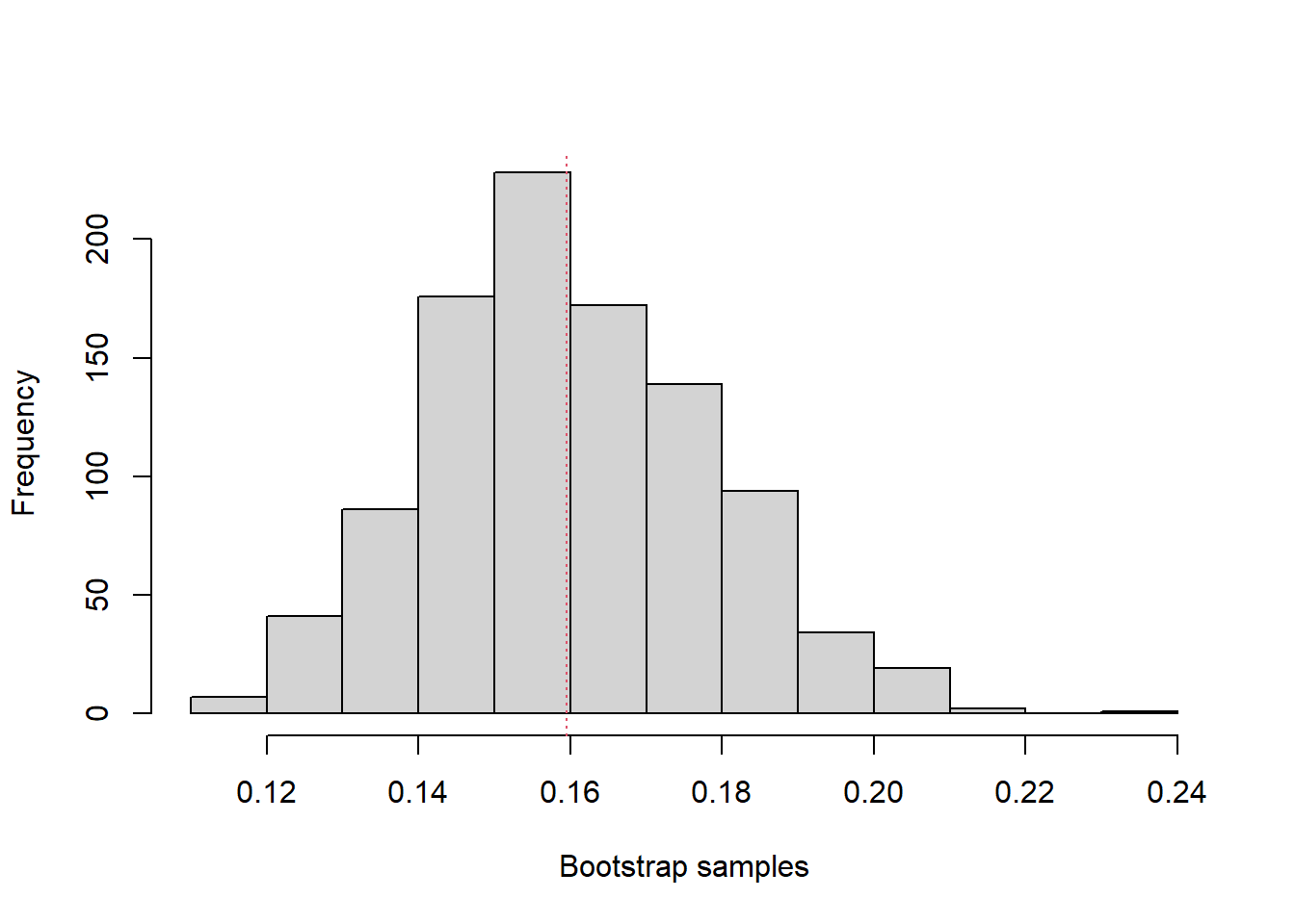
Using the bootstrap package:
library(bootstrap)
b <- bootstrap(sbr$diff, 999, mean)
quantile(b$thetastar, c(.025,.975))
2.5% 97.5%
0.127975 0.197500 mean(b$thetastar)[1] 0.1591947# the bootstrap standard error is the SD of the bootstrap distribution
sd(b$thetastar)[1] 0.01803024Both procedures shown above have led to similar results. The 95% CIs of the differences did not include zero, so a significant improvement in accuracy can be inferred.
6.4.2 Parametric and non-parametric paired sample tests
When two estimates are gathered from the same rater at different times, these data points are not independent. In such situations, a paired sample t-test can be utilized to test if the mean difference between two sets of observations is zero. This test requires each subject (or leaf, in our context) to be measured or estimated twice, resulting in pairs of observations. However, if the assumptions of the test (such as normality) are violated, a non-parametric equivalent, such as the Wilcoxon signed-rank test, also known as the Wilcoxon test, can be employed. This alternative is particularly useful when the data are not normally distributed.
To proceed with these tests, we first need to ascertain whether the paired differences are normally distributed. (The paired t-test does not require equal variances, because it is based on the differences.) Let’s now apply the two tests to our data and compare the results.
# normality test of the paired differences
shapiro.test(sbr$diff)
    Shapiro-Wilk normality test

data:  sbr$diff
W = 0.80256, p-value = 0.0009437
# paired t-test
t.test(sbr$aided, sbr$unaided, paired = TRUE)
    Paired t-test

data:  sbr$aided and sbr$unaided
t = 8.812, df = 19, p-value = 3.873e-08
alternative hypothesis: true mean difference is not equal to 0
95 percent confidence interval:
 0.1216158 0.1973842
sample estimates:
mean difference
         0.1595
# Wilcoxon test
wilcox.test(sbr$aided, sbr$unaided, paired = TRUE)Warning in wilcox.test.default(sbr$aided, sbr$unaided, paired = TRUE): cannot
compute exact p-value with ties
    Wilcoxon signed rank test with continuity correction

data:  sbr$aided and sbr$unaided
V = 210, p-value = 9.449e-05
alternative hypothesis: true location shift is not equal to 0
The Shapiro-Wilk test indicates that the differences depart from normality (P < 0.001), so the non-parametric test is the safer choice. Both tests nevertheless reject the null hypothesis of no difference between the aided and unaided conditions.
6.4.3 Mixed effects modeling
Mixed models extend linear models to data in which the observations are not independent. Here each rater estimated severity twice, once without and once with the SAD, so the estimates of the same rater are correlated (Brown 2021). A mixed model has fixed effects, the regression parameters of interest (here, the effect of using the SAD), and random effects, which capture the variation among groups of observations (here, among raters).
We treat raters as a random effect because they are a sample from a larger population of possible raters, and we want conclusions that apply to that population. Accounting for the differences among raters also makes the comparison between the aided and unaided conditions more precise.
Let’s start reshaping our data to the long format and assign them to a new data frame.
sbr2 <- sbr |>
  pivot_longer(2:3, names_to = "condition", values_to = "estimate")
Now we fit the mixed model using the lmer function of the lme4 package. We will fit the model to the logit of the estimate because they should be bounded between zero and one. Preliminary analysis using non-transformed or log-transformed data resulted in lack of normality of residuals and heteroscedasticity (not shown).
library(lme4)
library(car) # for logit function
mix <- lmer(logit(estimate) ~ condition + (1 | rater), data = sbr2)

# Check model performance
library(performance)
check_normality(mix)
OK: residuals appear as normally distributed (p = 0.381).check_heteroscedasticity(mix)OK: Error variance appears to be homoscedastic (p = 0.961).# Check effect of condition
car::Anova(mix)Analysis of Deviance Table (Type II Wald chisquare tests)
Response: logit(estimate)
Chisq Df Pr(>Chisq)
condition 458.44 1 < 2.2e-16 ***
---
Signif. codes: 0 '***' 0.001 '**' 0.01 '*' 0.05 '.' 0.1 ' ' 1# Estimate the means for each group
library(emmeans)
em <- emmeans(mix, ~ condition, type ="response")
em condition response SE df lower.CL upper.CL
aided 0.968 0.00359 25.5 0.959 0.974
unaided 0.817 0.01720 25.5 0.779 0.849
Degrees-of-freedom method: kenward-roger
Confidence level used: 0.95
Intervals are back-transformed from the logit scale # Contrast the means
pairs(em) contrast odds.ratio SE df null t.ratio p.value
aided / unaided 6.72 0.597 19 1 21.411 <0.0001
Degrees-of-freedom method: kenward-roger
Tests are performed on the log odds ratio scale # plot the means with 95% CIs
plot(em) +
coord_flip()+
xlim(0.7,1)+
theme_r4pde()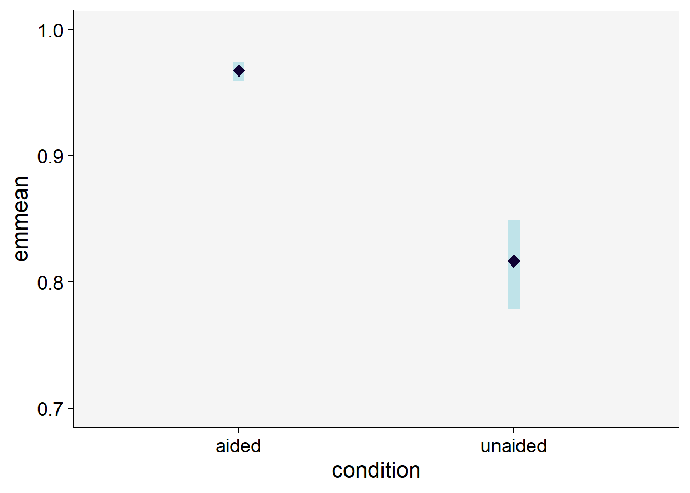
As shown above, we can reject the null hypothesis that the means are the same between the two groups.
Alternatively, we can fit a generalized linear mixed model (GLMM), which allows the response to follow a distribution other than the normal. Because the CCC is bounded between 0 and 1, a beta distribution is a natural choice. The glmmTMB() function of the glmmTMB package fits GLMMs with a variety of distributions (Brooks et al. 2017). We select the beta distribution with family = beta_family().
library(glmmTMB)
mix2 <-  glmmTMB(estimate ~ condition + (1| rater),
                 data = sbr2,
                 family = beta_family())
Residual diagnostics for GLMMs fitted with glmmTMB() are best obtained with the DHARMa package, which compares standardized residuals with residuals simulated from the fitted model.
library(DHARMa)

plot(simulateResiduals(mix2))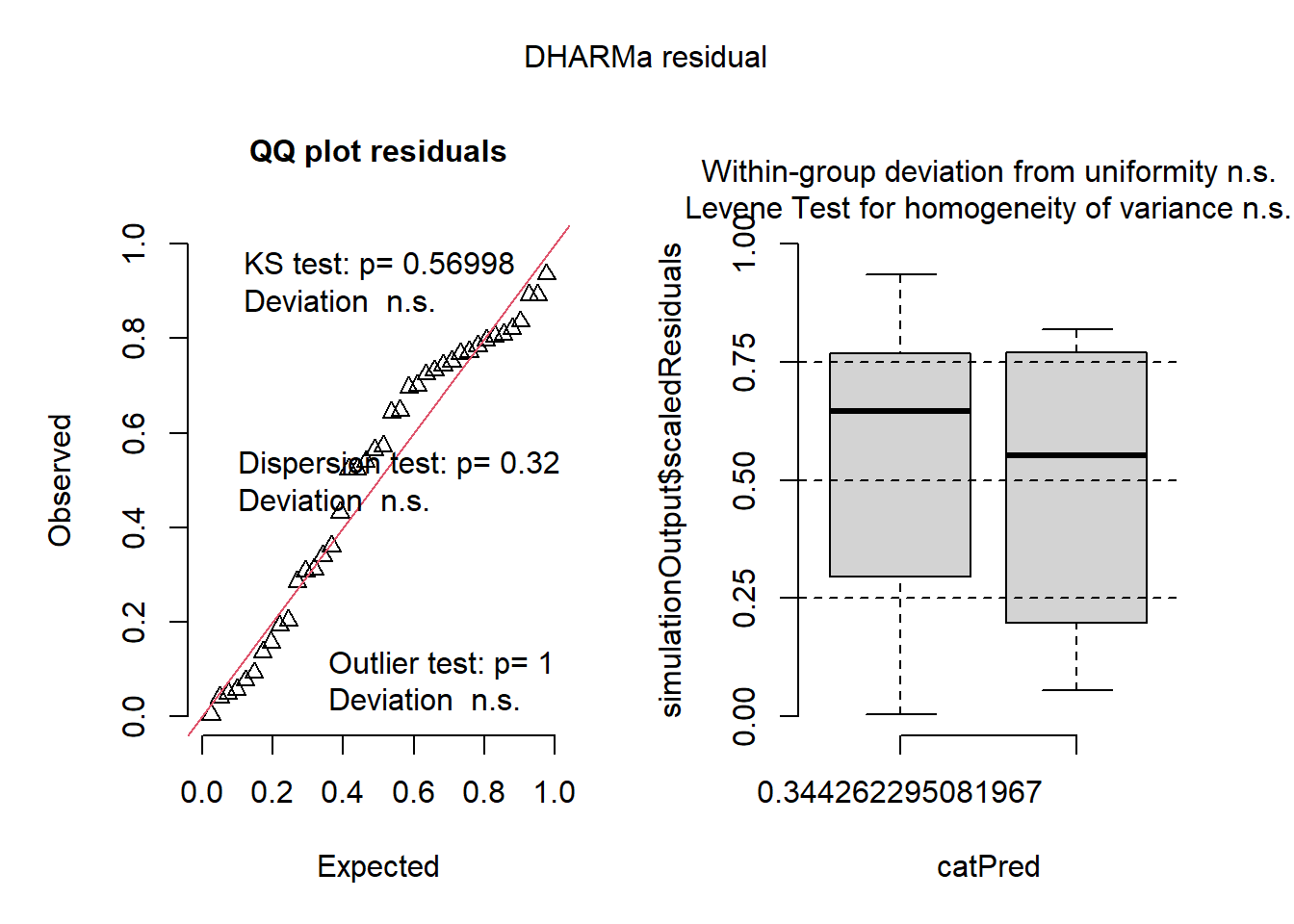
The simulated residuals are uniformly distributed, which is what we expect when the model fits the data well. We can now proceed with the post hoc comparison, and we see that the results are similar to those obtained with the logit-transformed response.
car::Anova(mix2)Analysis of Deviance Table (Type II Wald chisquare tests)
Response: estimate
Chisq Df Pr(>Chisq)
condition 400.93 1 < 2.2e-16 ***
---
Signif. codes: 0 '***' 0.001 '**' 0.01 '*' 0.05 '.' 0.1 ' ' 1library(emmeans)
em <- emmeans(mix2, ~ condition, type = "response")
em condition response SE df asymp.LCL asymp.UCL
aided 0.967 0.0043 Inf 0.958 0.975
unaided 0.814 0.0167 Inf 0.779 0.845
Confidence level used: 0.95
Intervals are back-transformed from the logit scale # Contrast the means
pairs(em) contrast odds.ratio SE df null z.ratio p.value
aided / unaided 6.71 0.638 Inf 1 20.023 <0.0001
Tests are performed on the log odds ratio scale